


Nvidia now supplies more AI compute capacity than every other vendor combined — roughly two-thirds of global H100-equivalent shipments.
That concentration shapes who can train huge language models, who wins cloud deals, and who gets the fastest chips.
This infographic cuts through confusing unit counts by using H100-equivalent capacity (a standard unit that maps other chips to Nvidia’s H100) and lays out the clear tiers: Nvidia, Google, then AMD/Amazon/Huawei and everyone else.
Read on to see the numbers, regional patterns, and the simple visuals that make the market split obvious — and what to watch next.
AI Chip Market Share Overview & Vendor Comparison (2023–2025)

Nvidia shipped 2.96 million H100-equivalent units in Q4 2025, grabbing nearly two-thirds of global AI compute capacity. That’s more than every other company combined. Google comes in second, but it’s not even close—they produce less than a third of what Nvidia does. AMD shipped 226,000 H100-equivalent units, Amazon delivered 221,000, and Huawei contributed 132,000. The concentration tells you everything: training large language models and running inference at scale still favors whoever has mature software ecosystems and proven hardware.
Why measure in H100-equivalent capacity instead of revenue or physical unit counts? Because AI accelerators are wildly different. Architecture, memory bandwidth, processing capabilities vary so much that comparing raw chip counts is useless. The H100e metric converts each chip’s peak dense 8-bit operations into the equivalent number of Nvidia H100 GPUs. One standardized unit. Direct comparison across vendors. Epoch AI’s Chip Sales database provides the primary source, though most estimates carry uncertainty ranges that span roughly 2× around the median. Chipmakers rarely disclose exact volumes.
Infographics should make this vendor hierarchy immediately clear through layered elements: a pie chart showing Nvidia’s near-two-thirds share versus all rivals, horizontal bar charts displaying exact H100-equivalent shipment counts, color-coded vendor labels for quick scanning, mobile-first responsive formatting that keeps text legible on small screens, and footnotes citing Epoch AI with a Q4 2025 timestamp. The pattern becomes obvious. Nvidia operates in one tier, Google in a second, and AMD/Amazon/Huawei in a third. Everyone else contributes minimal shares.
Key Visual Elements for AI Chip Market Share Infographics:
- Pie chart displaying Nvidia’s share versus combined competitors, labeled “nearly two-thirds”
- Horizontal bar chart listing top vendors with exact H100-equivalent shipment counts for Q4 2025
- Vendor color assignments (Nvidia, Google, AMD, Amazon, Huawei) maintained across all charts
- Mobile-first formatting that collapses legends, enlarges labels, and prioritizes vertical scroll
- Citation blocks noting Epoch AI Chip Sales database, Q4 2025 timeframe, and ~2× uncertainty range
| Vendor | Global Market Share (%) | Q4 2025 H100-Equivalent Shipments |
|---|---|---|
| Nvidia | ~66 | 2,960,000 |
| ~22 | <987,000 (estimated) | |
| AMD | ~5 | 226,000 |
| Amazon | ~5 | 221,000 |
| Huawei | ~2 | 132,000 |
Datacenter AI Chip Market Share Visualized Through Compute Capacity
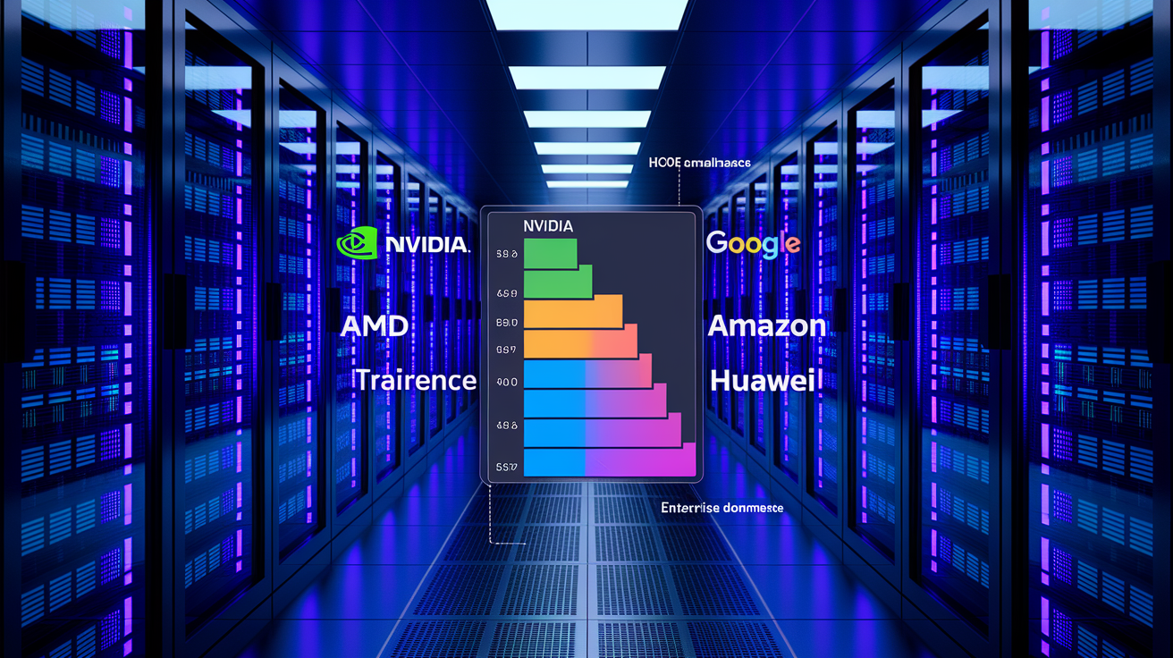
Datacenter workloads drive most AI compute capacity because training large foundation models and serving real-time inference at hyperscale demand chips with high memory bandwidth, multi-GPU interconnects, and software stacks optimized for distributed training frameworks. H100-equivalent normalization lets you compare Nvidia’s Hopper architecture against Google’s TPU v5, AMD’s MI300X, and Amazon’s Trainium chips on a single axis. It smooths over differences in FP8 throughput, HBM capacity, and on-chip networking. Without this standardization, comparing a 700-watt GPU to a custom ASIC running at lower precision is meaningless.
In Q4 2025, Nvidia supplied more datacenter AI compute capacity than every other vendor combined. It’s the default choice for commercial training clusters and multi-tenant inference deployments. Google’s second-place position reflects its internal TPU production, which powers Gemini training and YouTube recommendation engines but isn’t available for external purchase. AMD, Amazon, and Huawei each serve niche datacenter segments. AMD targets ROCm-compatible PyTorch users, Amazon provisions Trainium for AWS-native workloads, and Huawei equips domestic Chinese cloud providers under export restrictions.
Datacenter infographics should separate training-focused deployments (where batch size, gradient synchronization, and FLOP efficiency matter most) from inference workloads (where latency, power efficiency, and cost per token dominate). A stacked bar chart with two segments per vendor clarifies how some companies excel at training (Nvidia, Google) while others prioritize inference (Amazon Inferentia, AMD MI250X in certain configurations). Color intensity can indicate adoption velocity year over year.
| Vendor | Datacenter Compute Share | Notes |
|---|---|---|
| Nvidia | ~68% | Dominates both training (A100, H100) and inference (L4, L40) |
| ~20% | Internal TPU deployments; not sold externally | |
| AMD | ~6% | Growing in ROCm-compatible PyTorch environments |
| Amazon | ~6% | AWS-native Trainium/Inferentia for cost-sensitive inference |
Edge and Consumer AI Chip Market Share Representation

Edge and consumer AI chip markets work differently than datacenter compute because power budgets drop to single-digit watts, thermal envelopes constrain clock speeds, and software ecosystems favor integrated NPUs over discrete GPUs. Smartphones, smart cameras, automotive systems, and IoT devices run inference locally using specialized neural processing units that prioritize energy efficiency and real-time latency over raw FLOP throughput. Qualcomm’s Hexagon NPUs power flagship Android devices, Apple’s Neural Engine drives iPhone photo processing and Siri requests, and MediaTek’s APU series competes in mid-tier handsets across Asia.
Infographics for edge and consumer markets require different visual structures because market share splits by device category (smartphone, automotive, industrial IoT) rather than compute capacity. Stacked bar charts work well when showing year-over-year share shifts. Qualcomm might lead in units shipped, but Apple captures higher revenue per NPU due to premium device pricing. Color coding should distinguish between general-purpose edge accelerators (Qualcomm, MediaTek) and vertically integrated solutions (Apple Neural Engine, Tesla FSD chip). Annotations should note whether the vendor licenses IP (Arm’s Ethos-U) or ships finished silicon.
Visual Treatments for Edge and Consumer AI Chip Infographics:
- Stacked bar charts segmented by device type (smartphone, automotive, wearable, smart home)
- Color-coded vendor categories: integrated (Apple, Google Tensor), licensed IP (Arm), discrete (Qualcomm)
- Year-over-year delta arrows showing share gains or losses from 2023 to 2025
- Label conventions indicating whether figures represent units shipped, revenue share, or installed base
- Mobile-first layout rules that stack bars vertically on narrow screens and collapse legends into tooltips
Regional AI Chip Market Share Infographic Structure

Regional market share infographics must account for how export controls, local manufacturing incentives, and cloud infrastructure buildouts shape vendor access across geographies. The United States remains the largest market for AI accelerators, driven by hyperscaler datacenter expansion from Microsoft, Meta, and Google. China’s domestic AI chip industry (led by Huawei and emerging vendors like Biren, Cambricon) grew in response to U.S. restrictions on high-performance GPU exports. Europe and APAC markets reflect a mix of imported Nvidia hardware for research institutions and local edge-computing deployments using Arm-based designs.
Infographics should use choropleth maps to highlight regional concentration, with color intensity indicating compute capacity deployed per region and callout boxes noting policy drivers. Things like “U.S. CHIPS Act funding accelerates domestic fab construction” or “China’s self-sufficiency push grows Huawei datacenter share to 15% domestically.” Bar charts can sit alongside the map, ranking regions by total H100-equivalent capacity and breaking down vendor share within each territory. It becomes clear that Nvidia dominates globally except where export restrictions apply.
Regional Infographic Design Elements:
- Choropleth maps shading regions by total compute capacity or growth rate (2023–2025)
- Vendor-specific color overlays showing where Nvidia, AMD, or Huawei hold majority share
- Annotation callouts for policy events (export controls, subsidy programs, local content rules)
- Region-specific dominance patterns displayed in small multiples (one bar chart per continent)
Methodology, Data Sources, and Reliability of AI Chip Market Infographics
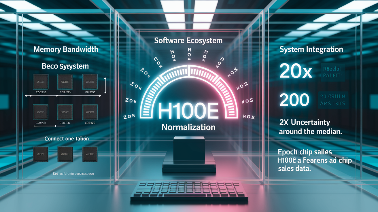
The H100-equivalent compute metric standardizes AI accelerator comparisons by converting each chip’s peak dense 8-bit tensor operations per second into the equivalent number of Nvidia H100 GPUs. A chip rated at 2,000 TOPS (tera-operations per second) in INT8 mode equals roughly one H100e unit. Side-by-side comparison of Nvidia’s Hopper architecture, Google’s TPU v5, AMD’s CDNA3, and Amazon’s Trainium without conflating different numeric precision levels or memory subsystems. This normalization makes market-share pie charts interpretable. Without it, a chart mixing GPU unit sales, TPU pod counts, and custom ASIC deployments is meaningless.
Epoch AI’s Chip Sales database compiles shipment estimates from public disclosures, supply-chain reports, and inference based on fab capacity, but most vendors treat exact volumes as confidential. Uncertainty ranges span roughly 2× around the median, meaning Nvidia’s 2.96 million H100e estimate could realistically fall between 1.5 million and 5.9 million units depending on datacenter utilization rates and double-counting corrections. Google’s “less than one-third of Nvidia’s output” figure is a relative benchmark rather than a precise count, derived from known TPU pod deployments and estimated workload intensity.
Performance variables limit how much real-world capability any single metric can capture. Memory bandwidth determines how quickly a model’s weights load during inference, software maturity (CUDA versus ROCm versus proprietary TPU frameworks) affects developer productivity, and server-level networking (NVLink, InfinityFabric, custom interconnects) changes multi-GPU scaling efficiency. An infographic that labels these caveats in a small methodology block builds trust without requiring readers to parse footnotes. Something like “H100e measures peak compute; actual performance depends on memory, software, and system design.”
| Factor | Impact on Market Share Interpretation |
|---|---|
| Memory Bandwidth | High HBM3 bandwidth boosts real throughput beyond peak FLOP ratings |
| Software Ecosystem | CUDA’s maturity gives Nvidia functional advantage over raw hardware specs |
| System Integration | Custom interconnects (NVLink, TPU pods) improve multi-chip scaling |
Infographic Design Techniques for AI Chip Market Share Visuals

Effective market-share infographics prioritize clarity over decoration. Use pie charts when emphasizing a single dominant player (Nvidia’s two-thirds share). Switch to horizontal bar charts when comparing five or more vendors with precise counts. Color palettes should assign each major vendor a consistent hue across all charts. Nvidia in green, AMD in red, Intel in blue, Google in multi-color. Readers recognize companies instantly without re-reading legends. Mobile optimization matters because most users encounter these infographics on phones. Labels must remain legible at small sizes, legends should collapse into interactive tooltips, and vertical scrolling should reveal details progressively rather than cramming everything into a single 1200-pixel-wide frame.
Accessibility requirements mean every chart needs alt text describing the data structure (“Pie chart showing Nvidia 66%, Google 22%, AMD 5%, Amazon 5%, Huawei 2%”) and sufficient color contrast to pass WCAG AA standards. Avoid pastel gradients that blur together on low-brightness screens. Export formats should include both PNG (for embedding in articles and social posts) and SVG (for high-resolution printing and further customization). Every file should carry a visible timestamp (“Data as of Q4 2025”) so viewers know when the snapshot was captured.
Infographic Design Best Practices:
- Pie charts for binary dominance stories (Nvidia vs. rest of market); bar charts for multi-vendor rankings
- Consistent color coding across all charts (Nvidia = green, AMD = red, Google = multi-color, etc.)
- Responsive layout that stacks elements vertically on screens narrower than 600 pixels
- Label density limits of no more than 8 data points per chart to avoid clutter
- Accessibility text providing structured data summaries for screen readers
- Export format options including PNG (web/social), SVG (print/edit), and CSV (raw data)
Final Words
In the action: the post laid out the global split, with Nvidia dominating Q4 2025 and Google, AMD, Amazon and Huawei trailing, and it gave a clear vendor comparison you can visualize.
It explained why H100‑equivalent compute is used to normalize architectures, broke down datacenter vs edge and regional views, and flagged data uncertainty and methodology caveats.
Use the ai chip market share infographic guidance — pie and bar charts, mobile‑first layouts, clear labels and citations — to build visuals that show the hierarchy clearly. You’ll have a practical, shareable asset ready to use.
FAQ
Q: What is the global AI chip market-share distribution in Q4 2025?
A: The global AI chip market-share distribution in Q4 2025 shows Nvidia supplying nearly two-thirds of compute capacity, with Google, AMD, Amazon, and Huawei trailing in smaller secondary tiers.
Q: Who are the leading AI chip vendors and their Q4 2025 compute counts?
A: The leading vendors are Nvidia (2.96M H100-equivalent units), AMD (226k), Amazon (221k), Huawei (132k), and Google (roughly one-third of Nvidia’s output).
Q: Why use H100-equivalent units to compare AI chip capacity?
A: Using H100-equivalent units normalizes compute across different architectures, letting viewers compare real performance capacity instead of raw chip counts for clearer infographics.
Q: How reliable are the market-share estimates from Epoch AI?
A: Epoch AI’s estimates are based on chip sales data but carry about 2× uncertainty; treat them as indicative for tiering and trends, not exact shipment counts.
Q: How should datacenter compute be visualized separately from global share?
A: Datacenter compute should be shown separately with bars or stacked charts highlighting H100-equivalent capacity, plus labels for training vs inference and Nvidia’s Q4 2025 dominance.
Q: How should edge and consumer AI chip market share be represented?
A: Edge and consumer segments should use stacked bars or mini-charts, color-code vendors like Qualcomm and Apple, and show YoY deltas to reflect smartphone and NPU-driven SoC trends.
Q: What visual elements must an AI chip market-share infographic include?
A: Include a pie chart for market share, a bar chart for H100-equivalent volumes, consistent vendor colors, a mobile-first layout, and a visible methodology citation near the graphic.
Q: How should regional AI chip market share be shown?
A: Regional market share should map US, Europe, APAC, and China with color-coded dominance overlays, callouts for regional leaders, and annotations noting limited numeric precision.
Q: What methodology details and caveats should the infographic state?
A: The methodology should explain H100-equivalent normalization, dense 8-bit peak operations basis, caveats like memory bandwidth and software differences, and the estimated ~2× uncertainty.
Q: What infographic design best practices should I follow for market-share visuals?
A: Design best practices include responsive layouts, clear labels, a limited color palette, accessibility text, exportable PNG/SVG outputs, and a concise methodology block under the graphic for trust.