


What if the next AI leap isn’t just smarter text, but systems that read images, hear audio, watch video, and mash those signals together?
The multimodal AI growth infographic below lays out the who, how fast, and where the money is going.
See clear numbers—$1.2M logistics savings, 50% faster product launches, 28% higher retail retention—and a timeline from GPT-3 to Gemini and beyond.
This intro shows what to highlight above the fold, which industry KPIs to call out, and how to structure charts so busy readers get the story in three seconds.
Visual Overview of Multimodal AI Growth Metrics and Infographic Structure

A multimodal AI growth infographic needs to do three things in the first three seconds: explain what the tech actually does, show how fast it’s growing, and make clear where the money’s going. Start with a header that nails the definition (multimodal AI processes text, images, audio, video, genomics, and sensor data all at once) and drop the big numbers right next to it. We’re talking $1.2M in average annual savings for logistics operations, 50% faster product launches in fintech and healthtech, 28% retention jumps for retail, and 30% shorter project cycles in pharma. Put those callouts above the fold. Busy readers will either stop scrolling or keep going based on what they see there.
Below that, build out six horizontal blocks. Each one walks the viewer through a different layer: market context, technical setup, what’s happening in specific industries, how autonomous agents fit in, and what deployment actually costs. Block two is your timeline. Chart the milestones (GPT-3, GPT-4, GPT-4V, GPT-5, Gemini, Sora, Runway Gen-2) and leave space for market size, CAGR, and venture funding totals from 2024 through 2026, then projected out three to five years. You’ll also want regional adoption heat maps and year-over-year growth percentages, but those need to come from external sources before you publish.
The middle blocks translate complexity into something you can actually scan. Block three diagrams the platform: unified data platform feeding into Lakehouse ETL pipelines, Fabric workflows, analytics consolidation, and Power BI interactive conversion. Label the compliance layers, unified governance, and M365 integration. Block four uses stacked bars or segmented charts to show industry KPIs (logistics savings, fintech speed, retail retention, pharma timeline cuts) with placeholders for production speed, downtime reduction, and forecasting accuracy. Block five is an icon grid for autonomous agents: legal summarizer, quantitative proofreader, PII redactor, data insights agent, document intelligence agent. Include enterprise workflows like invoice automation and AI-governed data flows. Block six closes with pricing tiers, migration accelerators (think “Chat With Your Data In a Day”), and a small footer for 2–3 source citations plus copyright year 2026.
Must-have elements:
- Large numeric callouts in high-contrast colors for market size, CAGR, and industry KPIs
- Timeline with year markers (2024, 2025, 2026) and forward projections, noting model milestones like GPT-4V and Gemini
- Stacked-bar or segmented bar charts showing sector adoption and investment trends
- Flow diagram mapping data platform architecture from ingestion through governance to BI output
- Icon grid for modalities (text, image, audio, data) and autonomous agent types
- Boxed callouts for pricing models (tiered packages, usage-based fees) and ROI metrics
Multimodal AI Market Expansion and Growth Trajectories for Infographic Data

The multimodal AI market is expanding on two tracks: the healthcare IT infrastructure where a lot of this gets deployed, and the venture-backed startups building the models and fusion engines. Healthcare IT is a good proxy because it captures the digitization of imaging, electronic health records, genomic databases, and sensor feeds. That’s exactly the multi-format data multimodal AI needs to work at scale. The numbers show healthcare IT growing from $303.4 billion in 2022 to a projected $974.5 billion by 2027, dipping to $728.63 billion in 2029, then climbing back to $1,069.13 billion by 2032. That volatility reflects infrastructure build-out cycles, regulatory shifts, and the uneven pace at which enterprises consolidate analytics platforms and adopt AI-native workflows. In your infographic, show this as a stacked-area chart with labeled inflection points and a note explaining that healthcare provider solutions account for roughly 38 percent of the market while IT services make up 52 percent.
Next to the dollar figures, reserve chart space for dataset scale expansion. Move from gigabyte-scale pilot projects in 2013 (when React launched and early image-text models emerged) to terabyte-scale production systems by 2019 (when mHealth hit $37 billion globally) and petabyte-scale multimodal training runs by 2024. This mirrors the model milestone sequence: GPT-3 handled text at scale, GPT-4 added reasoning depth, GPT-4V introduced vision, and GPT-5 plus Gemini pushed into true cross-modal fusion with audio, video, and structured data. Label these checkpoints on your timeline and project forward to 2028–2031, when real-time edge deployment and smaller, compute-efficient models are expected to dominate. Leave placeholders for CAGR estimates (probably 15–25 percent depending on segment) and venture funding totals. You’ll need to fill those with externally sourced data before publication, but the chart structure should already be ready.
| Year | Market Size | Notes | Visual Type |
|---|---|---|---|
| 2022 | $303.4B | Healthcare IT baseline; early multimodal pilots | Stacked-area chart node |
| 2027 | $974.5B (projected) | Rapid AI-native platform adoption; GPT-4V/Gemini era | Stacked-area chart node |
| 2029 | $728.63B (projected) | Consolidation phase; efficiency focus | Stacked-area chart node |
| 2032 | $1,069.13B (projected) | Edge deployment; real-time multimodal inference | Stacked-area chart node |
Key Milestones and Breakthrough Timeline in Multimodal AI
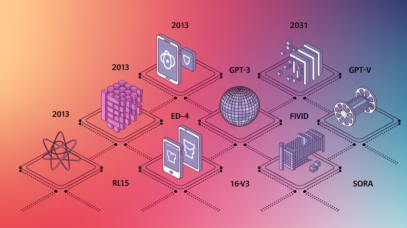
Your multimodal AI timeline should open in 2013 with the release of React. Not an AI milestone itself, but it marks when front-end interfaces started handling richer media and user interactions that would later need multimodal back ends. By 2019, mHealth was valued at $37 billion, signaling that smartphones were collecting multimodal health data (step counts, heart rates, photos of skin conditions) at population scale. That created demand for systems that could make sense of it all together. Place these context points alongside the core model breakthroughs that followed.
Model Milestone Sequence
GPT-3 (2020) demonstrated transformer scalability for text, setting the foundation for later multi-encoder architectures that would add vision and audio modules alongside the language core.
GPT-4 (2023) improved reasoning and instruction-following in text, proving that larger, better-tuned models could handle complex multi-step tasks that would soon span modalities.
GPT-4V (2023) added vision encoding, allowing the model to accept images and text together and reason across both. First widely deployed multimodal LLM.
Gemini (2023–2024) from Google DeepMind was natively multimodal, designed from the start to fuse text, images, audio, and video within a unified architecture rather than bolting encoders onto a text-first core.
Sora and Runway Gen-2 (2024–2026) are text-to-video and audio-visual generation models that demonstrated multimodal fusion in the generative direction, closing the loop from understanding (GPT-4V, Gemini) to creation.
Visualize this sequence as a horizontal timeline with model icons, release years, and brief capability labels. Extend a dotted projection line forward to 2028–2031 with placeholders for anticipated breakthroughs in real-time multimodal reasoning, edge-deployed fusion models, and improved explainability for clinical and regulated use cases.
Industry Adoption Metrics and Sector-Specific Impact Charts

Your industry impact block should turn abstract capabilities into concrete business outcomes. Use stacked bars or segmented charts to show how different sectors extract value from multimodal AI. Logistics operations report an average of $1.2 million in annual cost savings by combining sensor telemetry, video feeds from warehouses, and text-based order data to optimize routing and inventory. That’s early-fusion multimodal inference reducing waste and downtime. Fintech and healthtech companies have cut time-to-market by 50 percent by automating document processing, fraud detection, and patient intake workflows that used to require manual reconciliation of images (scanned IDs, medical imaging) with structured text (forms, EHRs).
Retail and e-commerce platforms have seen a 28 percent increase in customer retention by deploying multimodal recommendation engines that analyze product images, customer reviews (text), browsing video (interaction telemetry), and voice queries together to deliver more contextually relevant suggestions. Pharmaceutical firms have reduced project timelines by 30 percent, particularly in early-stage drug discovery, by fusing microscopy images, genomic sequences, clinical trial notes, and literature databases into unified search and analysis workflows that used to require separate tools and manual cross-referencing. Present these four KPIs as large callout numbers with brief explanatory labels. Add smaller bars below showing placeholder metrics for production speed improvements, downtime reduction percentages, and forecasting accuracy gains that can be populated with sector-specific data.
A stacked-bar chart should break out adoption by industry vertical: healthcare and life sciences at the top (highest investment and regulatory complexity), followed by media and content creation (using generative multimodal tools like Sora), then financial services (fraud detection, document intelligence), retail (personalization), and logistics (operations optimization). Each bar segment should use a distinct color and icon (stethoscope for health, shopping cart for retail, shipping box for logistics) to make the chart immediately scannable.
Top industry-level impacts:
Logistics: $1.2M average annual savings through sensor + video + order-data fusion for routing and inventory optimization.
Fintech & Healthtech: 50% faster time-to-market via automated multimodal document and image processing workflows.
Retail & E-commerce: 28% boost in customer retention from multimodal recommendation engines combining images, text reviews, and interaction telemetry.
Pharmaceuticals: 30% reduction in project timelines by integrating microscopy, genomics, clinical notes, and literature into unified discovery platforms.
Visualizing Multimodal AI Architecture, Fusion Techniques, and Model Scaling

The architecture diagram should depict the three-module pipeline that underpins most multimodal systems: an input module that ingests raw modalities and converts them to embeddings using modality-specific encoders (convolutional networks for images, transformer-based encoders for text, recurrent or attention-based encoders for audio and time-series data), a fusion module that aligns and combines those embeddings into a shared representational space, and an output module that produces predictions, classifications, natural-language explanations, risk scores, or treatment recommendations. Arrows flow left to right. Label where cross-attention layers operate and where joint representation learning happens. Call out that fusion can occur at three points: early (feature-level, combining raw embeddings before reasoning), late (decision-level, letting each modality produce a preliminary output and then voting or averaging), or hybrid (a mix of both, used in models like Gemini to balance speed and accuracy).
Beneath the architecture flow, include a small panel on model scaling, showing the trajectory from single-encoder unimodal models (tens of millions of parameters, gigabyte-scale datasets) to multi-encoder multimodal models (hundreds of billions of parameters, petabyte-scale datasets) and the emerging trend toward smaller, compute-efficient models that get comparable performance through better fusion techniques and data curation rather than brute-force parameter counts. This panel should reference the infrastructure requirements: distributed compute clusters, multi-dimensional array storage like TileDB, and Trusted Research Environments (TRE) for secure access to sensitive health or financial data. These are the enablers of the scaling curve.
Fusion technique comparisons:
Early fusion combines raw or lightly processed embeddings from all modalities before the main reasoning layers. Fastest inference but requires modalities to be well-aligned and risks one modality dominating if data quality is uneven.
Late fusion processes each modality independently through separate reasoning stacks, then outputs are combined via voting, averaging, or a lightweight meta-learner. More robust to data imbalance but computationally expensive and harder to train end-to-end.
Hybrid fusion uses early fusion for tightly coupled modalities (e.g., image + caption) and late fusion for loosely related inputs (e.g., audio ambiance + transaction logs). Balances performance and interpretability, now the default in production systems like Gemini and GPT-4V.
Data Infrastructure, Compute Demands, and Evaluation Benchmarks

Multimodal AI training and deployment require infrastructure that can handle multi-dimensional data at petabyte scale, query across modalities without expensive data movement, and enforce governance policies that span imaging devices, EHR databases, genomic repositories, and sensor networks. Visualize this as a stack: at the base, multi-dimensional array storage systems (e.g., TileDB) that unify images, time-series, and structured tables into queryable formats. Above that, Trusted Research Environments (TRE) that provide versioning, access control, and audit trails for sensitive data. At the top, the fusion models themselves, which pull pre-processed embeddings on demand rather than duplicating raw files. A callout should note that moving from unimodal to multimodal workflows often increases storage and compute costs by an order of magnitude, but reduces the need for duplicate pipelines and manual data reconciliation, netting a cost and time savings in mature deployments.
Evaluation benchmarks need to appear in the infographic to ground performance claims and help enterprises compare vendor offerings. VQA v2 (Visual Question Answering version 2) measures how accurately a model answers natural-language questions about images, testing both vision encoding and language reasoning. MedMNIST is a biomedical image classification benchmark that includes ten datasets (blood cells, tissue samples, X-rays) and evaluates whether models trained on one imaging modality generalize to others. Beyond these task-specific benchmarks, list core metrics: accuracy (correct predictions over total), F1-score (harmonic mean of precision and recall, useful when classes are imbalanced), BLEU (text generation quality, comparing model output to reference answers), and human-alignment ratings (expert reviewers scoring relevance and safety). A note should clarify that clinical and regulated deployments also require domain-specific tests, such as whether a model’s diagnostic suggestions match radiologist consensus or FDA-cleared decision thresholds.
| Benchmark | Metric Type | Visual Representation |
|---|---|---|
| VQA v2 | Accuracy (vision + language reasoning) | Bar chart comparing model scores (GPT-4V, Gemini, LLaVA) |
| MedMNIST | Classification accuracy across 10 biomedical datasets | Grouped bar chart by dataset and model |
| BLEU / Human-Alignment | Text quality and expert relevance ratings | Dual-axis line chart (BLEU score + human rating trend) |
Ethics, Governance, Bias, and Safety Visual Panels for Multimodal Systems

The infographic should dedicate a panel to the risks and governance requirements that multimodal AI introduces, particularly in healthcare, finance, and public-sector deployments where errors can cause direct harm. A risk heatmap is the most effective format. One axis lists risk categories (data standardization gaps, computational cost, bias and data imbalance, interpretability and explainability, privacy and consent). The other axis ranks severity (low, medium, high) and likelihood (rare, occasional, frequent). Color-code the cells: green for low-risk areas, yellow for moderate, red for high-priority concerns. Each cell should link to a brief mitigation note. Bias and data imbalance gets marked high-severity and frequent because studies have found that large language models, including Claude and ChatGPT, produce less effective treatment recommendations when a patient’s race is stated or implied as African-American. Multimodal systems can inherit and amplify biases present in training data.
Governance callouts should highlight Trusted Research Environments (TRE), which enforce versioning, access logs, and role-based permissions across imaging, genomic, and clinical datasets, and frameworks like FAIR (Findable, Accessible, Interoperable, Reusable) that ensure data can be audited and reproduced. Note that healthcare deployments often require models to produce explainable outputs, showing which input modalities (CT scan region, lab value, genetic marker) contributed most to a prediction. Regulatory bodies and clinicians need to trace the reasoning path before acting on AI recommendations. A small icon grid can represent the key governance components: padlock for access control, checklist for audit trails, scale for fairness monitoring, and magnifying glass for explainability.
Key visual modules for ethics and governance:
Risk heatmap: Color-coded matrix showing severity and likelihood of bias, explainability gaps, compute cost, data imbalance, and privacy concerns.
Bias metrics panel: Callout citing the study finding reduced recommendation quality for African-American patients, with a note on mitigation strategies (balanced training data, fairness audits, human-in-the-loop review).
Governance callouts: Icons and brief labels for TRE, FAIR data principles, role-based access, versioning, and regulatory validation requirements (FDA, CE mark, HIPAA compliance).
Autonomous Agents, Workflow Automation, and Enterprise ROI Graphics

Autonomous AI agents represent the operational edge of multimodal AI. Systems that not only understand multi-format inputs but act on them without human intervention. The infographic should present an icon grid showing five agent types: AI legal summarizer (reads contracts, case law PDFs, and email threads to produce risk summaries), quantitative proofreader (checks numerical consistency across spreadsheets, reports, and slide decks), PII redactor (scans documents, images, and audio transcripts to remove personally identifiable information before sharing), data insights agent (queries databases, visualizations, and unstructured notes to answer business questions in natural language), and document intelligence agent (extracts structured data from invoices, forms, medical records, and shipping manifests). Each icon should link to a brief use-case label and a placeholder metric, such as “processes 10,000 invoices per hour” or “reduces legal review time by 40 percent.” Populate those with client-specific data.
Enterprise ROI should be visualized as a set of KPI bars tied directly to the business outcomes listed earlier. A horizontal bar chart can show $1.2M average annual savings in logistics (combining sensor, video, and order data for route optimization), 50% time-to-market reduction in fintech and healthtech (automating document workflows), 28% retention boost in retail (multimodal recommendations), and 30% project timeline cut in pharma (unified discovery platforms). Below the bars, add smaller callouts for workflow-level improvements: invoice processing automation (reducing manual entry from days to minutes), AI-governed data pipelines (ensuring compliance and lineage tracking without human review), AI-powered approvals (routing contracts and expense reports based on content analysis), and predictive models (forecasting demand, churn, or equipment failure by fusing historical data, real-time telemetry, and external signals like weather or market trends).
The infographic should also include a pricing-tier visual. Three stacked boxes representing starter, professional, and enterprise packages, with usage-based fee notes (per API call, per gigabyte processed, per agent hour) and a highlighted “migration accelerator” offer such as “Chat With Your Data In a Day,” which promises a proof-of-concept deployment connecting a client’s existing databases to a multimodal query agent within 24 hours. This builds urgency and makes the ROI concrete.
Agent types mapped to workflow savings:
AI legal summarizer: Reads multi-format legal documents (PDFs, emails, case files) and produces risk summaries, cutting review cycles by an estimated 40%.
Quantitative proofreader: Validates numerical consistency across spreadsheets, reports, and presentations, reducing errors that cost enterprises an average of 3% of revenue annually.
PII redactor: Automatically scans text, images, and transcripts for personally identifiable information, ensuring compliance with GDPR and HIPAA without manual audits.
Data insights agent: Answers natural-language business questions by querying structured databases, dashboards, and unstructured notes, delivering answers in seconds instead of days.
Document intelligence agent: Extracts and classifies data from invoices, shipping forms, and medical records, automating workflows that previously required manual data entry and reconciliation.
Infographic Design Structure, Layout Templates, and Visual Storytelling Guidelines

An effective multimodal AI growth infographic balances dense information with scannable hierarchy, using size, color, and whitespace to guide the viewer’s eye from high-level takeaways to supporting details. The layout should follow a vertical scroll, divided into six horizontal blocks: header with definition and KPI snapshot, market and timeline, platform architecture diagram, industry impact metrics, autonomous agents and use cases, and deployment ROI with pricing. Each block should occupy roughly equal vertical space and use a consistent grid (three or four columns) to align text, charts, and icons. High-contrast numeric callouts (white text on dark backgrounds, or bold colors like electric blue and orange) should anchor each block. Smaller body text in neutral grays for context and labels.
Icons are essential for fast comprehension. Use simple, flat-design icons to represent modalities: a speech bubble for text, a camera for images, a waveform for audio, a database stack for structured data. For agent types, use profession-specific icons: a gavel for legal, a calculator for quantitative, a shield for PII redaction, a lightbulb for insights, a document with checkmark for intelligence. Consistency is critical. If you use blue for text modality in the architecture diagram, keep blue for text in the agent grid and timeline. Chart types should match the data: stacked-area or line charts for time-series market growth, grouped bars for industry adoption rates, flow diagrams with arrows for architecture, and a simple tiered-box layout for pricing.
The footer must include a sourcing area. Reserve space for 2–3 citations in small type, formatted as “Source: [Organization], [Year]” or “Data: [Report Title], [Date].” Add a copyright line reading “© 2026” to timestamp the infographic and signal that figures reflect current or projected market conditions. If the infographic will be updated quarterly, add a small “Last updated: [Month Year]” note to manage expectations around data freshness.
Essential design components:
Icons for modalities and agents: Use flat, simple icons (speech bubble, camera, waveform, database, gavel, calculator, shield, lightbulb) with consistent colors across all blocks.
Chart types matched to data: Stacked-area for market growth over time, grouped bars for sector adoption, flow diagrams for architecture, tiered boxes for pricing, heatmap for risk.
Color rules: High-contrast colors (electric blue, orange, white on dark) for numeric callouts; neutral grays for supporting text; one accent color per modality or risk level to maintain clarity.
Sourcing and timestamps: Small footer with 2–3 source citations, copyright “© 2026,” and optional “Last updated” line to anchor the infographic in time and build trust.
Final Words
We mapped the visuals and data every clear multimodal overview needs: market charts, CAGR projections, milestone timelines (GPT-4V, Gemini), sector KPIs, compute and governance callouts, and layout rules for footer sourcing.
Use the checklist to build an asset that answers both technical and business questions: who benefits, what the trends show, and where to cite sources. Make charts readable and keep annotations short.
This multimodal ai growth infographic will help teams make faster, evidence-based decisions and spark clearer conversations about next steps.
FAQ
Q: What elements must a multimodal AI growth infographic include?
A: The infographic must include market size charts, CAGR projections, milestone timelines (2024–2026), investment trend visuals, sector adoption bars, year‑over‑year comparisons, and a header snapshot with major KPIs.
Q: How should market growth and CAGR be shown in the infographic?
A: Market growth and CAGR should be shown with timeline charts (2024–2026 plus 3–5 year forecasts), annotated market‑size bars, TB→PB dataset scaling visuals, and clear notes on forecast assumptions.
Q: Which major model milestones and years should the timeline include?
A: The timeline should include GPT‑3, GPT‑4, GPT‑4V, GPT‑5/Gemini and Sora/Runway breakthroughs, with visible markers for 2019, 2022, 2024–2026 and projection points through 2032.
Q: How should industry adoption and sector impact be visualized?
A: Industry adoption should use stacked bars and segmented charts showing adoption rates and use‑case distribution, plus callouts for sector KPIs like $1.2M savings, 50% time‑to‑market, 28% retention lifts, and −30% timelines.
Q: What architectural visuals and fusion techniques should the infographic show?
A: The infographic should show encoder→fusion→output pipelines, early/late/hybrid fusion, cross‑attention and multi‑encoder stacks, plus parameter‑performance scaling and efficiency trends with simple diagrams.
Q: How should data infrastructure, compute needs, and benchmarks be presented?
A: Data infrastructure needs should display petabyte‑scale dataset visuals, TREs, compute trendlines, energy use, and benchmark rows for VQA v2 and MedMNIST with metrics like accuracy, F1, BLEU, and alignment ratings.
Q: What ethics, governance, and bias panels belong in the infographic?
A: Ethics panels should include an ethical risk heatmap, bias and fairness statistics, privacy/governance callouts, TRE compliance markers, and examples such as demographic impacts on treatment recommendations.
Q: How should autonomous agents and enterprise ROI be visualized?
A: Autonomous agents should map agent types (legal summarizer, proofreader, PII redactor, data insights) to workflow savings, showing KPIs like $1.2M savings, 50% speed gains, 28% retention, and −30% project timelines.
Q: What design and layout rules will make the infographic easy to read?
A: Design should use high‑contrast numeric callouts, modality icons, stacked bars, clear color rules, readable timelines, footer sourcing for 2026, and prioritized KPIs in a header snapshot for quick scanning.
Q: What sources and footnotes should the infographic include?
A: Sources and footnotes should state data years (2024–2026, projections to 2032), methodology for CAGR, dataset/storage notes, benchmark citations (VQA v2, MedMNIST), and a 2026 sourcing footer.
Q: Who is the intended audience for this infographic?
A: The infographic is for product managers, data scientists, investors, and execs tracking multimodal AI, offering quick KPIs, trends, and ROI visuals to support decisions and presentations.