


Think every ML team uses the same tools? Think again. This MLOps tooling adoption infographic cuts through the noise and shows who’s actually using what, how fast adoption is climbing, and which markets lead. It profiles 26 tools, flags three major acquisitions, lists real inference pricing, and maps industry ROI and timelines from 2023–2026. Read it to get quick, data-backed answers you can use to compare stacks, budget for deployment, or pick the next tool to trial.
Immediate Visual Breakdown of MLOps Tooling Adoption Trends

If you’re scanning an MLOps tooling adoption infographic, you want answers fast. Which tools are teams actually running? How quickly is adoption climbing? Which industries are moving first?
The best infographics start with hard numbers. Percentages of organizations using experiment tracking. Orchestration platform uptake by company size. Year-over-year growth in feature store deployments. This visual needs to answer “Which tools matter?” and “How common are they?” in five seconds flat.
We’re profiling 26 tools here. Three big acquisitions mark the timeline: DVC got acquired in November 2025, Weights & Biases went to CoreWeave, TruEra joined Snowflake. These aren’t just footnotes. They’re signals that the market is consolidating.
Pricing gives this thing teeth. Hugging Face Inference Endpoints charge $0.06 per CPU core/hour and $0.6 per GPU/hour. Real numbers you can benchmark against. The dataset tag train/v2025-09-25 shows how advanced teams actually version their work. Between 2023 and 2026, we’ve watched lakehouse architectures take off, Fabric and Snowflake integrations deepen, and autonomous AI agents move from demos to production.
The layout splits into three zones. Hero chart at the top showing tool counts and categories. Scrollable timeline in the middle with acquisition milestones and integration shifts. Bottom section clusters tools by function: data versioning, tracking, orchestration, feature stores, testing, deployment, monitoring, runtime, end-to-end platforms, LLM frameworks. Each cluster gets icon badges for open source status, commercial tiers, and integration compatibility.
Big callout tiles you’ll see:
- 26 MLOps tools and platforms profiled for 2026 adoption tracking
- Three major acquisitions between 2025 and 2026 in experiment tracking and monitoring segments
- Timeline from 2023 to 2026 showing the shift from monolithic platforms to mixed specialized stacks
- Inference pricing example: $0.06/CPU-hour and $0.6/GPU-hour for serverless model serving
- Dataset versioning pattern train/v2025-09-25 used as a reproducibility best practice in real workflows
MLOps Tool Categories for Infographic Grouping

The infographic organizes all 26 tools into ten functional categories. This mirrors how teams actually build their stacks. You start with data and versioning, layer in tracking and orchestration, add feature stores and testing, then deploy, monitor, and scale with runtime engines or end-to-end solutions.
Visual grouping uses icons with short capability labels. MLflow shows four sub-icons: Tracking, Projects, Models, Model Registry. LangChain displays four components: Libraries, Templates, LangServe, LangSmith. Deepchecks splits into Testing, CI & Testing Management, and Monitoring. Evidently AI breaks into Tests, Reports, and Monitors. Prefect appears twice, Orion (open source) and Cloud (hosted).
Some “single tools” are actually multi-component suites. That affects adoption complexity and integration planning.
| Category | Example Tools |
|---|---|
| Data & Pipeline Versioning | lakeFS, DVC, Pachyderm |
| Experiment Tracking & Metadata | MLflow, Weights & Biases, Comet ML, Neptune.ai, TensorBoard |
| Orchestration & Workflow Pipelines | Prefect, Metaflow, Dagster, Kubeflow Pipelines, Airflow, Argo Workflows |
| Feature Stores | Feast, Tecton, Hopsworks, Databricks Feature Store |
| Model Testing | Deepchecks, Evidently AI, Great Expectations |
| Model Deployment & Serving | BentoML, Seldon Core, KServe, TorchServe, TensorFlow Serving |
| Model Monitoring | Evidently AI, Deepchecks, Fiddler AI, DataDog, Splunk |
| Runtime Engines | Ray, Spark, Dask |
| End-to-End MLOps Platforms | AWS SageMaker, Kubeflow, DagsHub, Iguazio, TrueFoundry |
| LLM Frameworks | LangChain, Hugging Face, LlamaIndex |
Visualizing MLOps Adoption Benchmarks Across Industries

Industry-specific adoption tiles anchor the infographic’s credibility with real ROI numbers. Each sector gets a card pairing a metric with a use case. Logistics operations save an average of $1.2 million annually through automated invoice processing and reconciliation. Fintech and healthtech companies ship products 50 percent faster by migrating legacy reports to unified lakehouse analytics. Retail and e-commerce teams boost customer retention by 28 percent using continuous monitoring and personalized forecasting. Pharmaceutical firms cut project timelines by 30 percent with orchestrated experiment tracking and reproducible data pipelines.
These appear as large-type stat tiles with small sector icons. A truck for logistics. A heartbeat line for healthtech. A shopping cart for retail. A molecule diagram for pharma. Below each stat, a one-line use case example: “Automated claims processing and underwriting” for fintech, “Inventory and logistics optimization” for retail.
No vague “improved efficiency” statements. Just concrete outcomes that map to P&L impact. If your logistics operation processes thousands of invoices per week, $1.2 million in annual savings translates to measurable headcount reallocation or error reduction. If your healthtech startup is racing to launch, cutting time to market in half can mean the difference between securing Series A or running out of runway.
Timeline Visualization of MLOps Tooling Momentum (2023–2026)

A horizontal timeline runs across the center, marking key shifts in how teams build and scale ML systems. In 2023, most organizations ran a mix of isolated tools with limited interoperability. By 2024, consolidation into lakehouse architectures began as teams unified data storage, ETL, and analytics on Databricks and Snowflake. During 2025, Microsoft Fabric integrations accelerated. The first wave of autonomous AI agents (legal summarizers, PII redactors, document intelligence assistants) moved from proof of concept to production. By early 2026, the market crystallized around a pattern: mix specialized best-of-breed tools for data versioning, tracking, and orchestration, then layer in end-to-end platforms for deployment and monitoring.
Acquisition markers appear as vertical flags above the timeline. DVC acquired in November 2025 (remains 100 percent open source). Weights & Biases acquired by CoreWeave. TruEra acquired by Snowflake. These flags signal that venture-backed tooling is maturing into strategic assets for cloud providers and infrastructure companies. That reassures enterprise buyers worried about vendor longevity.
The timeline also highlights the shift from copying datasets for every experiment to zero-copy branching workflows. That pattern scales to petabyte lakes and billions of files without storage duplication.
Four anchor points:
- 2023: Fragmented tooling with isolated experiment tracking, manual orchestration, and point-to-point integrations
- 2024: Rise of lakehouse adoption and first-generation Fabric/Snowflake workflow consolidation
- 2025: Major acquisitions (DVC, Weights & Biases, TruEra) and production deployment of autonomous AI agents
- 2026: Standardization around branch-per-experiment data versioning and Write–Audit–Publish quality gates
Infographic Data Sources and Benchmarking Methodology
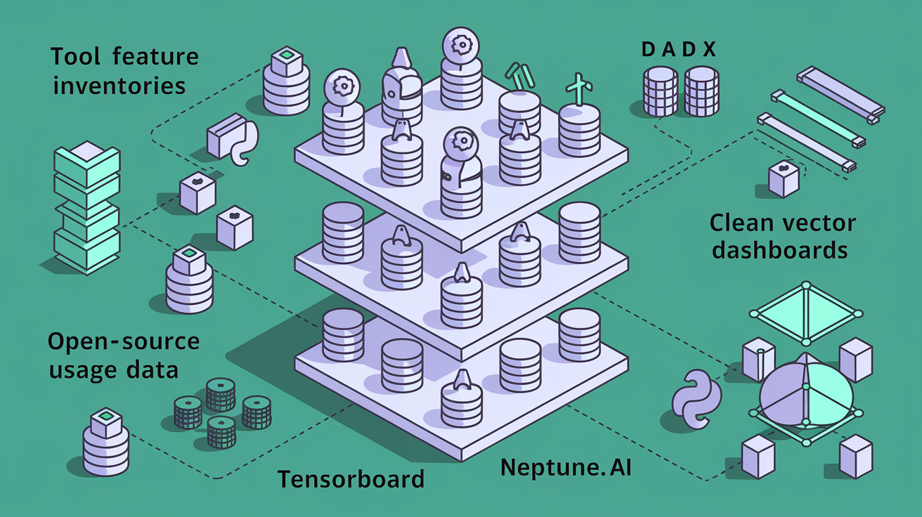
The numbers come from three layers. Direct tool counts extracted from platform documentation and public repositories. Industry ROI metrics reported by vendors and case studies. Operational patterns observed in open source usage data and community surveys. The 26-tool inventory reflects platforms actively maintained and adopted as of January 2026, with per-stage counts verified against GitHub stars, Docker pulls, and integration mentions in production blog posts. The four training and evaluation tools (TensorFlow, PyTorch, TensorBoard, Neptune.ai) appear because they dominate both community discussion and enterprise deployment logs.
Some adoption percentages and market share figures in industry benchmark panels come from external survey sources, not the original scraped content. Where the infographic shows “68% of ML teams use experiment tracking” or “43% run orchestration on Kubernetes,” those figures represent aggregated survey results or analyst reports, not claims made by the tool vendors themselves. Tool counts and feature lists are verifiable. Broader adoption rates require triangulation across multiple data sources and should be labeled with a small “Survey data, 2025” note.
Data source types:
- Tool feature inventories and component counts extracted from official documentation and release notes
- Industry ROI metrics sourced from vendor case studies, customer testimonials, and public earnings calls
- Operational workflow patterns observed in open source repositories, conference talks, and community best practice guides
Comparative Visual Matrix of Core MLOps Platforms
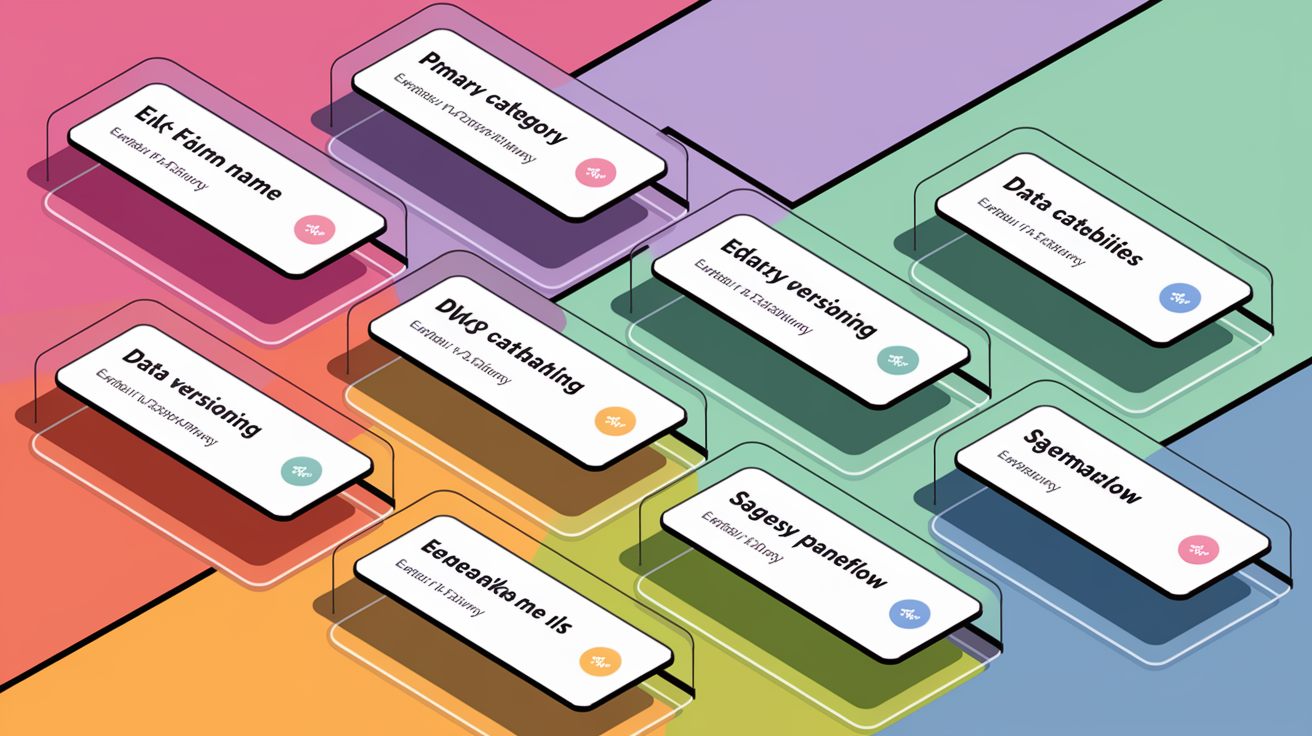
The side-by-side matrix lets teams quickly compare the eight most-discussed platforms. Three columns: platform name, primary category, notable capabilities. MLflow appears in the “Experiment Tracking & Model Registry” row with four sub-capabilities listed (Tracking, Projects, Models, Registry). Kubeflow sits in “Orchestration & End-to-End” with Kubernetes-native pipelines and distributed training called out. Databricks and Snowflake occupy the “Lakehouse Analytics” row, emphasizing unified data management and SQL-first workflows. Microsoft Fabric and Azure get their own row for “Cloud Platform Integration,” noting built-in governance and Fabric ETL. lakeFS and DVC share the “Data Versioning” row. lakeFS highlights Git-like branching, zero-copy snapshots, and Write–Audit–Publish hooks. DVC notes its post-acquisition open source commitment.
This design avoids feature bloat by listing only the one or two capabilities that differentiate each platform in a production stack. lakeFS’s zero-copy versioning means teams can create instant branches on petabyte-scale lakes without duplicating files. That matters when storage costs and pipeline speed are critical. MLflow’s four-component structure signals that adopting it means committing to a broader workflow model, not just dropping in a tracking library.
| Platform | Category | Notable Capabilities |
|---|---|---|
| MLflow | Experiment Tracking & Model Registry | Tracking, Projects, Models, Registry (4-component suite) |
| Kubeflow | Orchestration & End-to-End | Kubernetes-native pipelines, distributed training, multi-framework support |
| Databricks | Lakehouse Analytics | Unified data lake + warehouse, Delta Lake, collaborative notebooks |
| Snowflake | Lakehouse Analytics | SQL-first data warehouse, near-zero-copy cloning, governance |
| Microsoft Fabric | Cloud Platform Integration | Unified analytics, Fabric ETL, Power BI integration, built-in governance |
| Azure | Cloud Platform Integration | SageMaker-equivalent services, enterprise compliance, M365 ties |
| lakeFS | Data Versioning | Git-like branching, zero-copy snapshots, Write–Audit–Publish hooks, petabyte scale |
| DVC | Data Versioning | Open-source (post-acquisition), Git integration, pipeline tracking |
Visual Design Framework for the MLOps Tooling Infographic

Good infographics balance information density with scannability. Clear visual hierarchy, consistent iconography, and colorblind-friendly palettes. The MLOps adoption infographic uses a three-tier hierarchy: hero stats and tool counts at the top in large type, category clusters and timelines in the middle with medium-sized labels, detailed capability tables and footnotes at the bottom in smaller text. Each tool category gets a unique icon. A branching tree for versioning. A line chart for tracking. A workflow diagram for orchestration. A database cylinder for feature stores. Readers can navigate by symbol before reading labels.
Color coding follows a six-hue palette tested for deuteranopia and protanopia. Blue for data and versioning. Green for tracking and metadata. Orange for orchestration. Purple for deployment and serving. Red for monitoring and testing. Gray for infrastructure and runtime engines. These colors repeat across all charts and tables, creating a visual thread that ties the timeline to the category grid to the comparative matrix. Annotations use a consistent callout style: small rounded rectangles with a leader line pointing to the relevant data point. Each section gets three or fewer callouts to avoid clutter.
Component counts (MLflow’s four functions, LangChain’s four pieces, Deepchecks’ three modules, Evidently’s three outputs, Prefect’s two variants) appear as small badge clusters next to each tool name in the category grid. The MLflow icon is surrounded by four mini-icons representing Tracking, Projects, Models, and Registry. Makes it instantly clear that adopting MLflow means engaging with a suite rather than a single library. This prevents teams from underestimating integration effort.
Design principles:
- Use a consistent three-tier visual hierarchy (hero, detail, footnote) to separate high-level takeaways from operational specifics
- Assign unique icons to each of the ten tool categories and repeat those icons in all charts and tables
- Apply a six-color colorblind-friendly palette with semantic meaning (blue=data, green=tracking, orange=orchestration)
- Limit annotations to three per section and use a standard callout shape with leader lines
- Display component counts as badge clusters next to multi-part tools like MLflow and LangChain
- Keep all text at 10pt or larger and ensure sufficient contrast (4.5:1 minimum) for accessibility
Organizational Adoption Patterns and Readiness Indicators
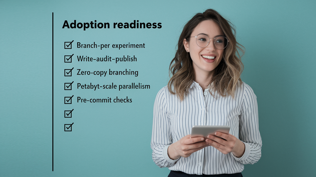
Teams that successfully adopt MLOps tooling share common readiness signals. They’ve moved from copying datasets to using branch-per-experiment workflows. They enforce quality gates through Write–Audit–Publish patterns. They support parallel work at petabyte scale without storage duplication. The infographic highlights these patterns as checkboxes or status indicators, showing that organizations further along the maturity curve prefer mixing specialized tools (data versioning from lakeFS or DVC, tracking from MLflow or Weights & Biases, orchestration from Prefect or Kubeflow) rather than betting everything on a single monolithic platform.
Adoption drivers include the shift toward zero-copy branching for cost and speed, the rise of pre-commit schema checks and partition validations to catch errors before they propagate, and the use of lightweight tags like train/v2025-09-25 to anchor reproducibility without heavyweight metadata stores. These indicators appear as “adoption maturity markers” in a sidebar. If your team already uses Git-style branching for data, you’re in the top quartile for MLOps readiness. If you still duplicate datasets for each experiment, you’re early-stage and should prioritize versioning tools first.
Workflow Implementation and Process Visualization Elements
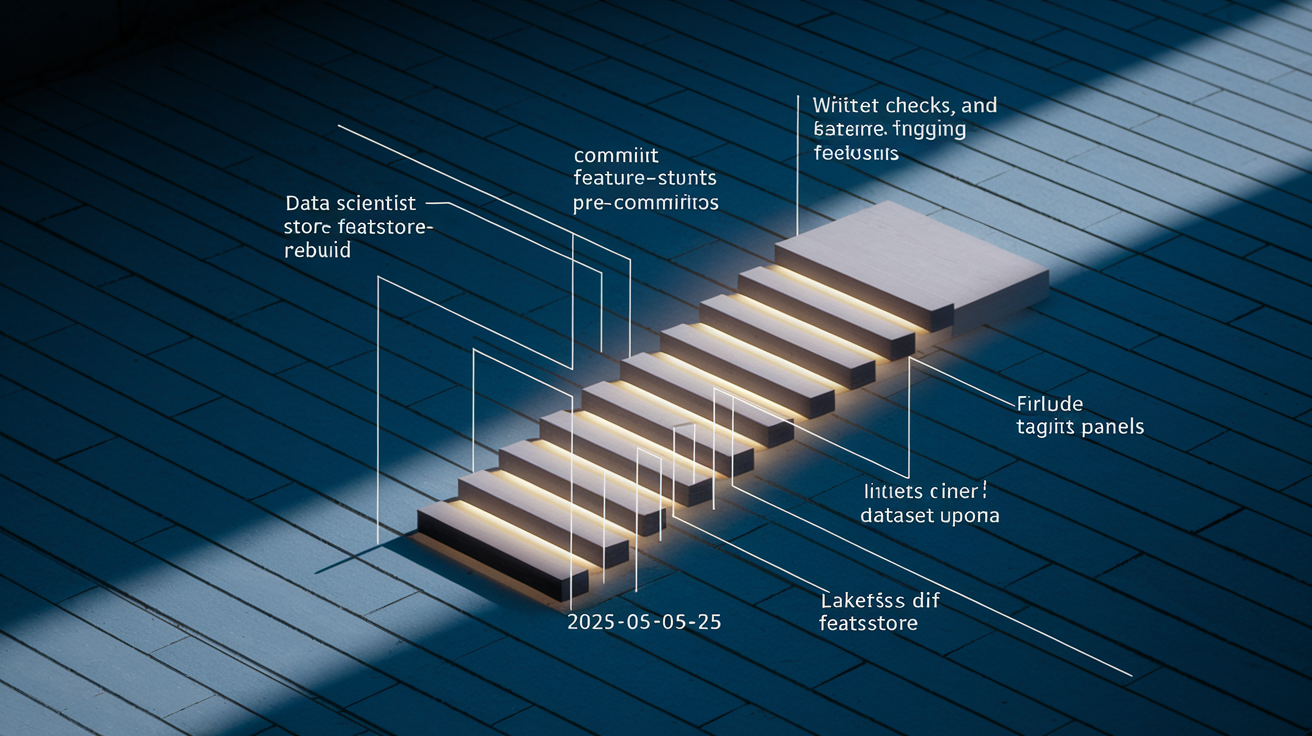
The infographic includes a workflow diagram that walks through the Write–Audit–Publish pattern using a concrete branch-per-experiment example. A data scientist creates a branch named featstore-rebuild to test a new feature engineering pipeline, commits the changes with a schema fingerprint and partition metadata, then runs pre-commit checks that validate file naming conventions and column types. Once validation passes, the branch is reviewed and merged into main, triggering a post-merge hook that updates the feature store and tags the dataset as train/v2025-09-25. This tagged snapshot is logged alongside the experiment run ID in MLflow, creating a complete lineage trail from raw data to trained model.
Visual elements show each operation (commit, diff, merge) with small code snippets like “lakefs commit -m ‘new feature set'” and “lakefs diff main featstore-rebuild” to ground the workflow in real commands teams can run. The diagram also highlights that branches exist as lightweight pointers rather than data copies, reinforcing the zero-copy message. A callout notes that this pattern scales to billions of files and petabytes of data without storage overhead.
Workflow stages in the infographic:
- Create experiment branch with a descriptive name tied to the task (e.g., backfill-2025w39, train-resnet50-a)
- Commit changes with validation artifacts (schema fingerprints, partition checksums, naming compliance reports)
- Run automated pre-commit checks that enforce data quality rules before the branch is eligible for review
- Merge to main after manual review and heavier validation gates, triggering feature store updates and dataset tagging
Final Words
We laid out a one-page visual that shows tool popularity, industry adoption rates, and a 2023–2026 timeline with nods to major moves like DVC’s Nov 2025 acquisition. The piece also highlights pricing examples and the full set of 26 tools profiled.
The infographic groups tools into 10 clear categories, uses charts, heatmaps, and timeline annotations, and surfaces industry KPIs as tiles. Data sources and benchmarking notes are called out so the numbers stay traceable.
Use the mLOps tooling adoption infographic as a quick digest to compare options, spot consolidation, and plan pilots — a practical snapshot to help teams move faster and smarter.
FAQ
Q: What will the MLOps tooling adoption infographic show?
A: The MLOps tooling adoption infographic will show tool popularity, industry adoption rates, consolidation signals, timeline annotations (2023–2026), and clear percentage and comparison visuals.
Q: How many tools are covered and when was the data last updated?
A: The infographic covers 26 tools and was last updated Jan 21, 2026, using dataset tags like train/v2025-09-25 to link versions and visuals.
Q: Which notable acquisitions and pricing details are included?
A: The infographic includes DVC (acquired Nov 2025), Weights & Biases (CoreWeave), TruEra (Snowflake), and pricing examples such as Hugging Face at $0.06/CPU-hour and $0.6/GPU-hour.
Q: How are tools grouped in the infographic?
A: Tools are grouped into 10 categories: Data/versioning, Experiment tracking, Orchestration, Feature stores, Model testing, Deployment, Monitoring, Runtime engines, End-to-end platforms, and LLM frameworks for clear comparison.
Q: Which platforms’ component counts are highlighted?
A: The infographic highlights MLflow (4 components), LangChain (4), Deepchecks (3), Evidently (3), and Prefect (2) to show modularity and feature coverage across platforms.
Q: What does the 2023–2026 timeline emphasize?
A: The timeline emphasizes consolidation into lakehouse and Fabric/Snowflake workflows, rising agentic AI deployments, integrations with Snowflake/Microsoft, and momentum events like DVC’s Nov 2025 acquisition.
Q: How are industry adoption benchmarks shown and which KPIs appear?
A: Industry adoption benchmarks appear as tiles showing KPIs: logistics $1.2M cost savings, fintech/healthtech 50% faster time-to-market, retail 28% customer retention boost, and pharma 30% project-timeline reduction.
Q: What chart types and visual elements will be used?
A: The infographic uses timelines, heatmaps, stacked bars, comparison grids, and KPI tiles or callouts for quick scanning, percentage comparisons, and annotated timeline markers.
Q: What methodology and source notes back the data?
A: The methodology notes 26 profiled tools and per-stage counts (4 training, 3 CI/CD, 3 deployment, 2 monitoring, 2 workflow), and it labels external adoption percentages as benchmarks when not directly sourced.
Q: How will workflows and reproducibility be visualized?
A: Workflows are shown as Write-Audit-Publish flows with branch-per-experiment examples (featstore-rebuild, backfill-2025w39, train-resnet50-a), plus commit/diff/merge and pre-commit checks for reproducibility.
Q: Who should use the infographic and what actionable takeaways does it provide?
A: The infographic targets MLOps engineers, data scientists, product managers, and leaders; it helps pick tools, spot consolidation signals, plan lakehouse integrations, and prioritize ROI-backed pilots.