


Which explainability technique actually helps people — not just data scientists?
This post shows an infographic design that makes visual explainability techniques easy to scan: side-by-side technique cards, color-coded global vs local panels, a comparison matrix, accuracy-vs-interpretability scatter, and concrete example panels (PDP grid, SHAP waterfall, Breakdown).
Thesis: a clean, minimal infographic that highlights one-line definitions, three pros and cons, complexity badges, and model-type icons lets busy readers compare methods and pick the right tool in seconds.
Visual Comparison of AI Explainability Techniques for an Infographic

You want an explainability techniques comparison infographic that actually works? Put your technique cards side by side with minimal text and clear visual hierarchy. Busy readers should scan definitions, pros, cons, and complexity in seconds. Each card needs an icon, a one-line definition (ten to twelve words max), three pros, three cons, a complexity badge (Low, Med, High), and model-type icons (tabular, text, image, sequence). Anchor everything with a comparison table that summarizes definition, applicable model types, interaction handling, runtime, and best use cases.
Color-coding does the heavy lifting. Global techniques get blue panels, local techniques get orange ones. Drop in a trade-off scatter plot that positions each method along accuracy-versus-interpretability axes. Now add example panels from real datasets: a Partial Dependence Plot grid using age values [3, 24, 45, 66], a SHAP waterfall moving from base value -0.192 to final prediction 0.14, and a Breakdown example where mean model prediction sits at 26.7 percent but one instance climbs to 83 percent. Those concrete numbers replace vague hand-waving.
At the infographic’s foundation, five core visual elements keep things clear:
- Technique cards with icons, single-sentence definitions, and three-item pros/cons lists
- Comparison matrix table listing global versus local scope, model compatibility, runtime, and interaction handling
- Accuracy-versus-interpretability scatter with numbered technique markers and legend
- Practical example panels displaying dataset artifacts (PDP grid, SHAP waterfall, Breakdown stepwise attribution)
- Color legend and complexity badges to guide rapid filtering by reader need
| Category | Typical Methods | Complexity Level |
|---|---|---|
| Global | PDP, ALE, Surrogate Models | Low – Medium |
| Local | SHAP, LIME, Breakdown, Counterfactuals | Medium – High |
| Hybrid | Aggregated SHAP, Attention (global rollup) | Medium |
Breakdown of Global AI Explainability Techniques for Infographic Use

Global explainers summarize how a model uses features across the entire dataset. They’re perfect for infographics that need to communicate overall behavior patterns or satisfy regulatory audits. Because they aggregate predictions or effect estimates, global methods trade instance-specific nuance for interpretability and computational efficiency. Position global techniques in a dedicated panel on the left or top so readers immediately recognize which methods answer “How does the model treat this feature everywhere?” instead of “Why did the model decide this way for a single person?”
Most comparison infographics anchor their global section with Partial Dependence Plots (PDP), Accumulated Local Effects (ALE), and surrogate models like decision trees. These three cover a spectrum. PDP offers intuitive marginal-effect curves but struggles with correlated features. ALE addresses correlation bias by computing interval-based local differences. Surrogate models compress the original model into a simpler, fully interpretable structure, trading some fidelity for transparency.
Partial Dependence Plots (PDP)
Partial Dependence Plots compute the average predicted outcome when a single feature gets systematically replaced across a grid of values. The four-step calculation defines a grid (say, age = [3, 24, 45, 66]), replaces the target feature in every row with each grid value, averages the resulting predictions at each grid point, and plots the curve. PDP cards in an infographic should note that the method is model-agnostic, fast, and visually intuitive. Perfect for quick global checks on feature shape. “Does higher age raise predicted stroke risk monotonically?”
Key weakness: PDP ignores feature interactions and can produce unrealistic feature combinations. Picture pairing a three-year-old with a BMI of 30. Runtime studies report PDP and ALE perform similarly, so infographics should mark both as low-to-medium compute.
Accumulated Local Effects (ALE)
Accumulated Local Effects, introduced by Apley in 2018, split a feature into intervals, average prediction differences within each interval, accumulate those effects across intervals, and center the result so the mean effect equals zero. This interval-based approach prevents the marginalizing-out problem that biases PDP when features correlate. An infographic card should highlight that ALE handles correlated features better and remains unbiased, while runtime stays comparable to PDP. The trade-off is slightly less intuitive interpretation because ALE plots show accumulated local differences rather than raw marginal predictions. For datasets with strong correlations (income and education, age and tenure), ALE is the go-to global method.
Surrogate Models (Decision Trees etc.)
Surrogate models train a simple, interpretable model (commonly a shallow decision tree or linear regression) to mimic a complex black-box model’s predictions. An infographic should describe surrogates as model-agnostic, globally interpretable rule sets that simplify audit and regulatory reporting. The main advantage? Human-readable output. If statements or linear coefficients. The main disadvantage is fidelity: a five-leaf decision tree may misrepresent a deep neural network’s nuances. Infographics typically label surrogates as medium complexity and note their best use case as compliance documentation or stakeholder communication when full model transparency isn’t practical.
| Method | Definition | Handles Correlation | Runtime | Best Use Case |
|---|---|---|---|---|
| PDP | Average prediction over grid values | No (marginalizes features) | Low–Medium | Quick monotonic checks |
| ALE | Accumulated interval differences, centered | Yes (local intervals) | Low–Medium | Correlated features |
| Surrogate | Simplified interpretable model copy | Depends on surrogate | Medium | Compliance reports |
| Feature Importance | Aggregate contribution (tree models) | No (marginal aggregates) | Low | Fast global ranking |
Key Local Explainability Techniques to Include in a Comparison Infographic
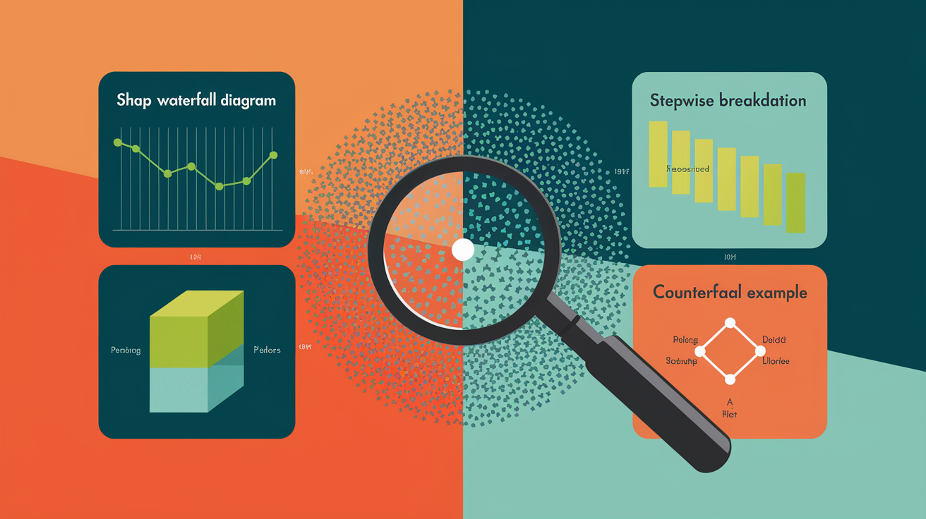
Local explainability techniques answer “Why this prediction for this instance?” They attribute the outcome to individual feature values or show what changes would flip the decision. Infographics group local methods into a separate panel, often color-coded orange or green, so readers quickly distinguish instance-level tools from global summaries.
Local methods outperform global methods when:
- Individual fairness or accountability matters (explaining a loan denial to one applicant)
- Feature interactions change dramatically across the dataset (global averages hide critical exceptions)
- Actionable recourse is required (showing what a user can change to get a different outcome)
- Debugging rare predictions where global patterns don’t apply
SHAP Waterfall & Local Shapley Attributions
SHAP (SHapley Additive exPlanations), developed by Lundberg and Lee in 2017, decomposes a single prediction into additive contributions from each feature using Shapley values from cooperative game theory. An infographic card should specify three main explainer classes: TreeExplainer for tree-based models, DeepExplainer for neural networks, and KernelExplainer for model-agnostic use. A waterfall example anchors the concept: base value -0.192 (the dataset mean log-odds) shifts to final prediction 0.14 after adding positive and negative feature contributions.
SHAP is theoretically sound, supports both local and aggregated-global views, and runs faster than iterative methods like Breakdown in many benchmarks. The downsides? Medium-to-high compute cost (especially for KernelExplainer) and complexity that can overwhelm non-technical stakeholders.
LIME Perturbation-Based Explanation
LIME (Local Interpretable Model-agnostic Explanations) perturbs the input instance by randomly sampling nearby points, collects model predictions on those samples, and fits a simple surrogate (often a sparse linear model) weighted by proximity to the original instance. Infographic cards should note LIME is fast, model-agnostic, and provides local explanations in minutes. The main weakness is instability. Perturbing the same instance twice can yield different feature attributions because the random sample changes. LIME works well for quick prototypes or user-facing dashboards where consistency across runs is less critical. It remains popular for text and image models where sampling semantically meaningful neighbors is straightforward.
Breakdown and Breakdown Interaction
Break Down, published in 2018, builds a local explanation by iteratively fixing one variable at a time in a greedy order and measuring how each step changes the prediction. Concrete example from a stroke prediction dataset: the mean predicted probability is 26.7 percent, but fixing age first increases the mean by 46 percentage points. Continue fixing additional features one by one to reach the instance prediction of 83 percent.
Break Down Interaction extends the method to capture non-additive effects by testing pairs of variables. Infographic cards should flag that contributions depend on variable order, making the method less stable than SHAP, but the stepwise narrative is highly intuitive for non-experts. Compute cost is higher than SHAP per recent studies, so Break Down is recommended for smaller, less sparse datasets where interpretability beats speed.
Counterfactual Explanation Methods
Counterfactual explanations optimize for the nearest input that would change the model’s output to a desired class, solving a constrained minimization: min over x-prime of distance(x, x-prime) plus a penalty on the loss between predicted(x-prime) and target. An infographic example might show “Change income from 45k to 52k and debt-to-income from 38 percent to 32 percent to flip the loan decision from Deny to Approve.”
Counterfactuals are highly actionable and align with how humans naturally reason about recourse. The downsides are high computational cost (requires iterative optimization), potential for multiple valid counterfactuals (which one to show?), and sensitivity to feature constraints (some changes may not be realistic). Infographics should position counterfactuals as best for user-facing applications where individuals need concrete next steps.
Visual Comparison Matrix Design for Explainability Techniques

A comparison matrix table sits at the center of an effective explainability infographic, condensing technique trade-offs into a scannable grid. The matrix uses five or six columns (global versus local, model compatibility, compute cost, robustness, interpretability level, and best-for use cases) to let readers filter by their need in seconds. Color-coding reinforces the message: green cells for high interpretability (PDP, ALE, surrogate models), yellow for moderate (LIME, attention mechanisms), and red for low or complex (KernelSHAP, counterfactuals).
The matrix should list techniques in rows sorted by typical workflow: global methods first (PDP, ALE, feature importance, surrogates), then local methods (SHAP, LIME, Breakdown, anchors, counterfactuals), and finally model-native methods (gradient saliency, attention) at the bottom. This ordering mirrors how teams usually explore a model. Start with global summaries, drill into local explanations for edge cases, and finish with domain-specific visualizations like heatmaps or attention weights.
| Technique | Global/Local | Compute Cost | Robustness | Interpretability | Best For |
|---|---|---|---|---|---|
| PDP | Global | Low–Medium | Stable | High (simple curves) | Monotonic checks |
| SHAP | Both | Medium–High | Very stable | Medium (additive math) | Instance attribution |
| LIME | Local | Low | Unstable (random) | High (sparse linear) | Quick prototypes |
| Counterfactuals | Local | High | Varies by optimizer | Very high (actionable) | User recourse |
| Attention | Local (native) | Low | Model-dependent | Medium (not always faithful) | NLP token attribution |
Recommended visual formatting practices include:
- Use three contrast colors (green for interpretable, yellow for moderate, red for complex) and neutral gray for text
- Add small icons next to model-compatibility cells (tree, neural net, transformer, generic) to reduce reading time
- Keep cell text under ten words per entry to preserve scan speed on mobile displays
Incorporating Gradient-Based and Attention-Based Methods into Infographic Comparisons

Gradient-based methods compute the derivative of a model’s output with respect to the input, visualizing which pixels or tokens most influence the prediction. Saliency maps calculate ∇x fc(x) and plot absolute gradient magnitudes as heatmaps overlaid on the original image. “Before the cat-versus-dog classifier outputs ‘dog,’ which pixels mattered most?” Grad-CAM refines this by weighting gradients with activation maps from a chosen convolutional layer, producing class-discriminative localization maps. Integrated Gradients accumulate gradients along a straight-line path from a baseline (often a black image) to the input, providing a more stable attribution that satisfies axioms like completeness.
Attention-based methods extract and visualize the attention weights that transformers compute during forward passes. For a language model predicting the next token, attention heatmaps show which input tokens the model “looked at” most heavily. These visualizations are intuitive. Readers see which words influenced a sentiment label or which image patches guided object detection. But they’re not always faithful explanations because attention weights can be uncorrelated with actual causal influence.
Infographics should separate gradient and attention approaches with a small comparison panel or side-by-side cards. The panel can include one example heatmap for each: a Grad-CAM overlay on a medical scan highlighting a tumor region, and a token-level attention matrix for a sentence classification task. Both methods share low to medium compute cost because they require only one or a few forward and backward passes, making them suitable for real-time or large-batch deployments.
Four key contrasts between gradient and attention approaches belong in any infographic:
- Gradient methods apply to any differentiable model, attention methods require models with explicit attention layers (transformers, attention-augmented CNNs)
- Gradient heatmaps measure sensitivity to input changes, attention weights show internal routing of information (which may or may not correspond to sensitivity)
- Gradient explanations can be noisy (especially vanilla saliency), attention explanations tend to be smoother but sometimes highlight spurious tokens
- Integrated Gradients offers axiom-based guarantees (completeness, sensitivity), raw attention has no such formal guarantees and is often used for exploratory insight rather than rigorous attribution
Accuracy–Interpretability Trade-Offs to Highlight in the Infographic
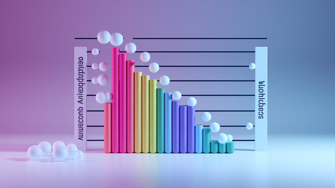
Every explainability technique balances two competing demands: preserving the fidelity of the original model’s predictions (accuracy retention) and producing explanations that humans can quickly understand and trust (interpretability). An infographic scatter plot maps each technique along these two axes, with interpretability on the vertical and accuracy retention on the horizontal. Simple methods cluster in the upper left (high interpretability, moderate fidelity), while complex post-hoc methods sit in the lower right (high fidelity, harder to interpret).
Feature importance for tree models and surrogate decision trees anchor the high-interpretability end because they produce short lists or simple if-then rules. PDP and ALE sit slightly to the right. They preserve marginal effects accurately but require readers to interpret line charts. SHAP and Breakdown move further right, offering near-complete fidelity through additive decomposition but demanding more cognitive effort to parse waterfall or force plots. Counterfactual methods land in the lower right because they solve optimization problems and can return multiple solutions, requiring additional user guidance to choose the most actionable recourse.
Five techniques mapped along the continuum:
- Surrogate trees – highest interpretability (if-then rules), moderate fidelity loss
- PDP/ALE – high interpretability (line plots), low fidelity loss for marginal effects
- SHAP – medium interpretability (additive bar charts), very high fidelity
- Breakdown Interaction – medium interpretability (stepwise narrative), high fidelity with order-dependence caveat
- Counterfactuals – lower interpretability (requires optimization literacy), highest actionability and fidelity to recourse paths
Infographics should use this continuum to guide method selection: pick left-side techniques for stakeholder communication and compliance dashboards. Pick right-side techniques for debugging, fairness audits, and user-facing recourse systems.
Real-World Examples and Dataset Panels for Explainability Infographics

Concrete dataset examples anchor abstract technique descriptions, turning “SHAP uses Shapley values” into “SHAP moved the base stroke risk from log-odds -0.192 to 0.14 by adding contributions from age, BMI, and smoking status.” Example panels in an infographic should include the dataset name, the specific technique applied, and the notable numeric result, preferably in a small table or annotated screenshot of the visualization. The Stroke Prediction Dataset appears in multiple scraped sources and provides a clean tabular benchmark: a PDP for age using grid [3, 24, 45, 66] shows how predicted stroke probability rises with age, while an ALE plot for the same feature demonstrates centering and interval-based accumulation.
Computer vision models typically pair gradient-based saliency or Grad-CAM overlays with medical imaging tasks. An infographic panel might show a chest X-ray with a Grad-CAM heatmap highlighting lung opacities that drove a pneumonia classifier’s positive prediction. Natural language processing examples use token-level attention heatmaps: a sentiment model processing the sentence “The service was terrible but the food was amazing” might show high attention weights on “terrible” and “amazing,” illustrating how the model resolves conflicting sentiment signals. Tabular examples use SHAP waterfall charts or Breakdown step plots to explain credit scoring, fraud detection, or patient readmission predictions.
Three example domains and their natural technique pairings:
- Computer vision (image classification, segmentation) – Grad-CAM, saliency maps, Integrated Gradients for pixel-level attribution
- NLP (sentiment, question-answering, translation) – Attention heatmaps, SHAP for token importance, LIME for sentence-level perturbations
- Tabular (finance, healthcare, logistics) – SHAP waterfall, Breakdown stepwise, PDP/ALE for global trends, counterfactuals for loan or treatment recourse
| Example | Technique | Notable Metric/Value |
|---|---|---|
| Stroke Prediction (age PDP) | PDP | Grid [3, 24, 45, 66]; shows monotonic rise |
| Stroke Prediction (instance SHAP) | SHAP Waterfall | Base -0.192 → final 0.14 |
| Stroke Prediction (Breakdown) | Breakdown Interaction | Mean 26.7% → instance 83%; age +46 pp |
Practical Guide for Selecting AI Explainability Methods in Infographic Form

Choosing the right explainability technique depends on three questions: What type of model are you explaining (tree, neural net, transformer, vision)? Do you need a global summary or a local instance explanation? How much compute time and technical expertise can you allocate? An infographic decision tree starts with model type at the root, branches to scope (global or local), and finishes with compute constraints. For example, a tree-based classifier with a compliance requirement flows to “global” → “use PDP or ALE,” while a deep vision model with a fairness audit requirement flows to “local” → “use SHAP TreeExplainer if available, else Integrated Gradients.”
PDP works best for fast monotonic checks when features are roughly independent. ALE replaces PDP when features correlate. Think income and education, or age and tenure. SHAP provides per-instance additive attributions across nearly any model type. Use TreeSHAP for gradient-boosted models to cut compute cost. Breakdown offers highly intuitive stepwise narratives but carries order-dependence and higher runtime, so reserve it for small datasets or critical high-stakes cases where human comprehension trumps speed. Counterfactuals generate actionable recourse (“change X to Y to flip the decision”), perfect for user-facing applications like loan denials or college admissions. Vision models default to saliency maps or Grad-CAM for pixel-level insights, while NLP models use attention visualization plus Integrated Gradients for token attribution. Compliance and audit workflows favor surrogate models (simple global rules) combined with aggregated SHAP summaries for defensibility.
Seven-item method picker:
- Need fast global feature-shape check, minimal interaction → PDP
- Global check with correlated features → ALE
- Per-instance attribution, tree model → SHAP (TreeExplainer)
- Per-instance attribution, neural net or black-box → SHAP (DeepExplainer or KernelExplainer) or LIME
- Highly intuitive stepwise local explanation, small dataset → Breakdown Interaction
- Actionable user recourse (what to change) → Counterfactual optimization
- Vision pixel attribution or NLP token attribution → Grad-CAM (vision) or Attention + Integrated Gradients (NLP)
A text-form decision tree description: Start at the root labeled “Model type.” If tree-based, branch left to “Scope?” If global, select PDP (independent features) or ALE (correlated features). If local, select SHAP TreeExplainer. If neural net or transformer, branch right to “Input type?” If image, select Grad-CAM or Integrated Gradients. If text, select Attention heatmaps plus SHAP or LIME. If tabular neural net, select SHAP DeepExplainer or counterfactuals. At each leaf, add a compute-cost badge (Low, Med, High) and a one-line use-case note.
| Need | Recommended Technique |
|---|---|
| Fast global trend, independent features | PDP |
| Global trend, correlated features | ALE |
| Per-instance attribution, any model | SHAP (TreeExplainer for trees, KernelExplainer otherwise) |
| Actionable recourse for end users | Counterfactual optimization (DiCE, etc.) |
Final Words
We mapped a compact, visual blueprint for an infographic that compares global, local, and hybrid explainability methods. It lays out PDP, ALE, SHAP, LIME, gradient and attention approaches, plus an accuracy–interpretability chart and dataset example panels.
You get layout and color tips, side-by-side cards, a comparison matrix, numeric examples (PDP grids, SHAP base shifts, Breakdown percentages), and a practical method picker for real projects.
Treat the ai explainability techniques comparison infographic as a one-page cheat sheet to clarify model behavior, speed decisions, and build trust.
FAQ
Q: What is the ideal structure for an AI explainability techniques comparison infographic?
A: The ideal structure for an explainability comparison infographic lays out side-by-side technique cards, a small trade-off chart, a comparison table, example panels, and a clear legend showing global vs local explainers.
Q: What core visual elements should an explainability infographic include?
A: The core visual elements an explainability infographic should include are: side-by-side cards, color-coded global/local labels, icons for method type, a compact trade-off chart, and a short numeric example panel.
Q: How do global, local, and hybrid explainers differ?
A: Global, local, and hybrid explainers differ by scope: global explains overall model behavior, local explains single predictions, and hybrid mixes both for aggregated instance insights with varying complexity and fidelity.
Q: What is a Partial Dependence Plot (PDP) and when should you use it?
A: A Partial Dependence Plot (PDP) shows average model effect for a feature using grid values (e.g., 3,24,45,66) and is best for simple, mostly independent features and monotonic checks.
Q: What is Accumulated Local Effects (ALE) and why choose it over PDP?
A: Accumulated Local Effects (ALE) measures interval-based feature effects, handles correlated features better than PDP, is unbiased for correlations, and runs in comparable time to PDP in practice.
Q: What are surrogate models and when are they useful?
A: Surrogate models are simple models (like decision trees) trained to approximate a complex model; they’re useful for global summaries when interpretability matters, but they trade off fidelity for simplicity.
Q: What is SHAP and what does a SHAP example illustrate?
A: SHAP provides local Shapley attributions; a SHAP example shows contributions from a base value (e.g., -0.192) to a final prediction (e.g., 0.14), useful for per-instance attribution and fairness checks.
Q: What is LIME and when should you use it?
A: LIME is a perturbation-based local surrogate that explains a single prediction by fitting a simple model to nearby samples; use it when you need quick, model-agnostic local explanations.
Q: What are Breakdown methods and how do they differ from SHAP or LIME?
A: Breakdown methods allocate prediction parts stepwise (mean 26.7% → instance 83%), offering intuitive stepwise contributions and interactions; they’re simpler to read but can be less theoretically unified than SHAP.
Q: What are counterfactual explanations and when should they be included?
A: Counterfactual explanations show minimal input changes needed to change a prediction, offering actionable guidance; include them when users need clear, changeable steps for decisions or recourse.
Q: When do local methods outperform global methods?
A: Local methods outperform global ones when you need per-instance explanations, actionable recourse, debugging specific errors, or interpretable insights for high-stakes individual decisions.
Q: How should a visual comparison matrix be designed for explainability techniques?
A: A visual comparison matrix should include columns for global/local, model compatibility, compute cost, robustness, interpretability, color-coded ratings, and clear icons to speed scanning.
Q: How should gradient-based and attention-based methods be shown in infographics?
A: Gradient-based and attention methods should be shown with example heatmaps or overlays, short notes on faithfulness vs intuition, and a caption explaining when each is appropriate for vision or NLP.
Q: How should the accuracy–interpretability trade-off be represented visually?
A: The accuracy–interpretability trade-off should be a simple continuum or scatter chart mapping techniques (PDP/ALE high interpretability, SHAP/Breakdown higher fidelity, counterfactuals actionable) with short labels.
Q: What example datasets and panels work well in explainability infographics?
A: Example datasets and panels that work well include stroke prediction (tabular), Grad‑CAM overlays for medical images, and token-level attention for NLP, each showing one concise metric or visual example.
Q: How do you pick the best explainability method for an infographic?
A: Pick explainability methods by need: monotonic checks → PDP, correlated features → ALE, per-instance → SHAP or Breakdown, actionable recourse → counterfactuals, vision → Grad‑CAM, NLP → attention.